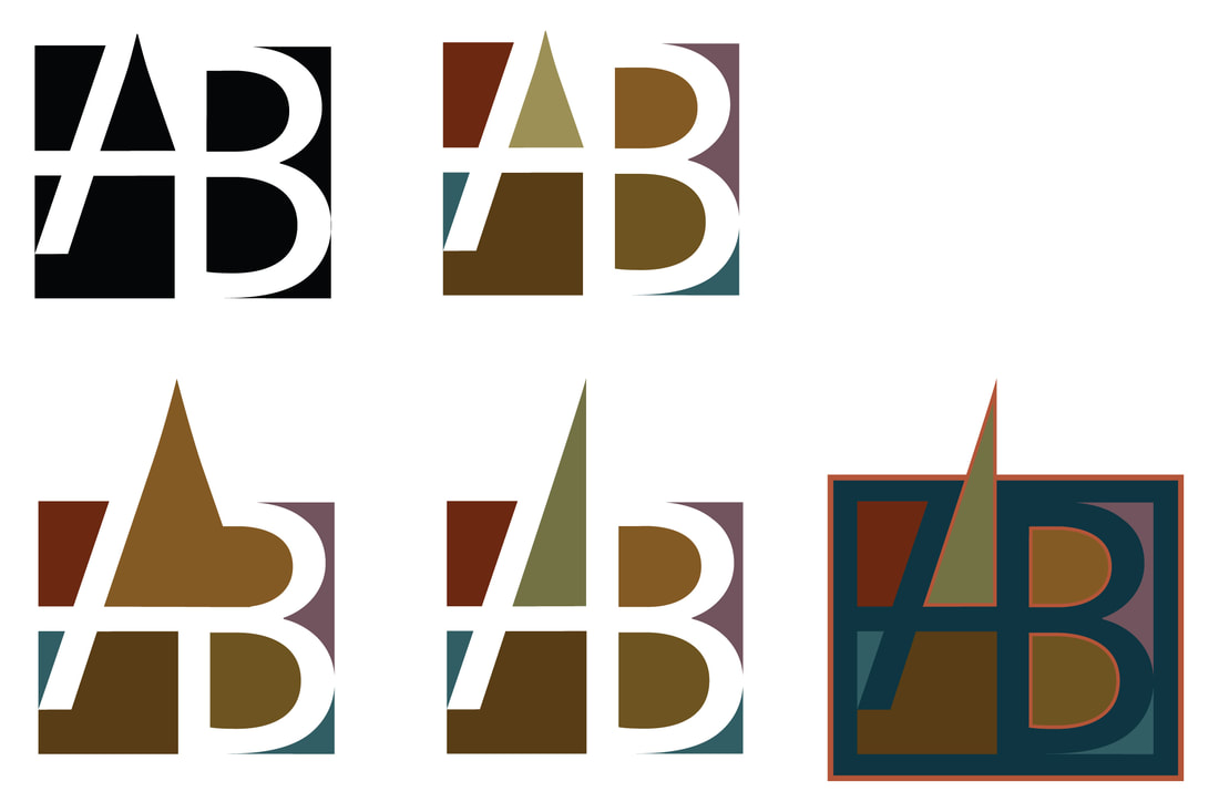
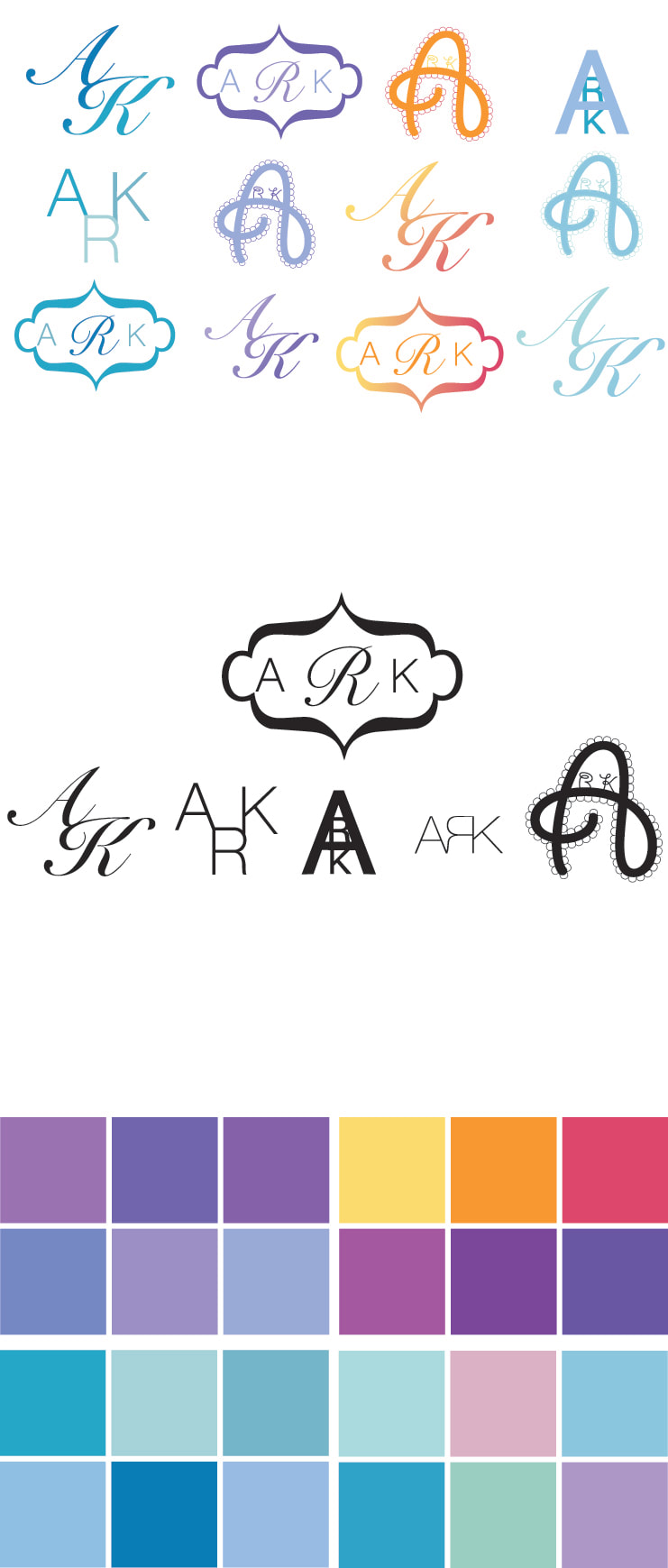
Letterform - n. Two letters put together to form a symbol.
Placing two letters together in this way can create negative space and another shape.
Due Date:
One day
Project:
Typeset the initials of your name (or for a company that has two or three initials).
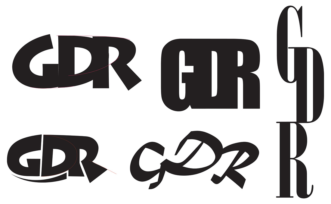
Create a logo (a visual identifier) for yourself by having the letters of your name form a symbol. Be aware of the negative space you are creating in the process, and think about the image you are projecting with this symbol.
Do at least 5 treatments in black, then make some variations in color.
Your objectives are:
Demonstration:
Color:
Once you have completed five treatments in black, create some color combinations – make a few full color personal letterform logos from the black designs.
(Project from Graphic Design on the Desktop, by Marcelle Lapow Tour)
Media:
Adobe Illustrator
To turn in:
Grading Criteria:
CONCEPT
Clear Communication of Idea
Inventiveness
DESIGN
Well-Chosen Typeface
Image has Visual Impact
CRAFTSMANSHIP
Skillful use of tools of Illustrator
WORK HABITS
To Start:
Type your initials independently of one another. Copy and paste them several times. Try versions with all caps, all lower case, and a combination.
Placing two letters together in this way can create negative space and another shape.
Due Date:
One day
Project:
Typeset the initials of your name (or for a company that has two or three initials).
Create a logo (a visual identifier) for yourself by having the letters of your name form a symbol. Be aware of the negative space you are creating in the process, and think about the image you are projecting with this symbol.
Do at least 5 treatments in black, then make some variations in color.
Your objectives are:
- to make connections between the physical characteristics of the letters;
- to create new interesting negative space; and
- to create an overall design that is unified and looks like a symbol.
Demonstration:
- Selection of letters
- Making connections between parts
- Looking to create interesting negative space
- Converting type to outlines
- Eliminating awkward “jogs”
- Adding, removing, adjusting anchor points – shifting angles
Color:
Once you have completed five treatments in black, create some color combinations – make a few full color personal letterform logos from the black designs.
(Project from Graphic Design on the Desktop, by Marcelle Lapow Tour)
Media:
Adobe Illustrator
To turn in:
- Unlock all
- Select all
- Type -- Create Outlines
- Save As: “letterform yourlastname.eps” in EPS format (to your Desktop)
- Drag file into the Graphic Design network folder
Grading Criteria:
CONCEPT
Clear Communication of Idea
Inventiveness
DESIGN
Well-Chosen Typeface
Image has Visual Impact
CRAFTSMANSHIP
Skillful use of tools of Illustrator
WORK HABITS
To Start:
Type your initials independently of one another. Copy and paste them several times. Try versions with all caps, all lower case, and a combination.
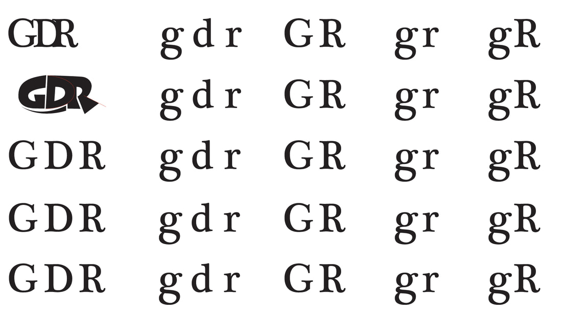
Experiment with typefaces, sizes, placement. Look for areas of possible connections.
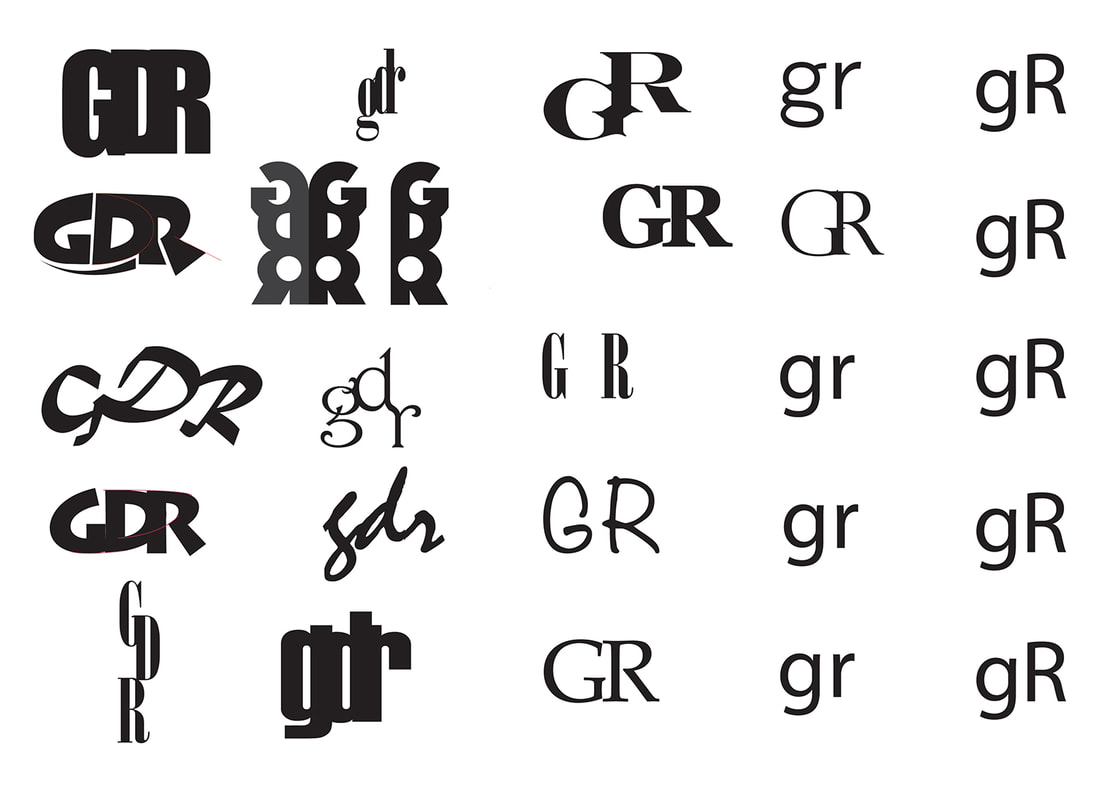
Refine your best thumbnail designs. Use guidelines as necessary. Use the Pathfinder of Illustrator to combine letters, and to delete parts of letters to eliminate "jogs" and awkward elements.
Test out palettes by aligning square swatches of colors to compare combinations.
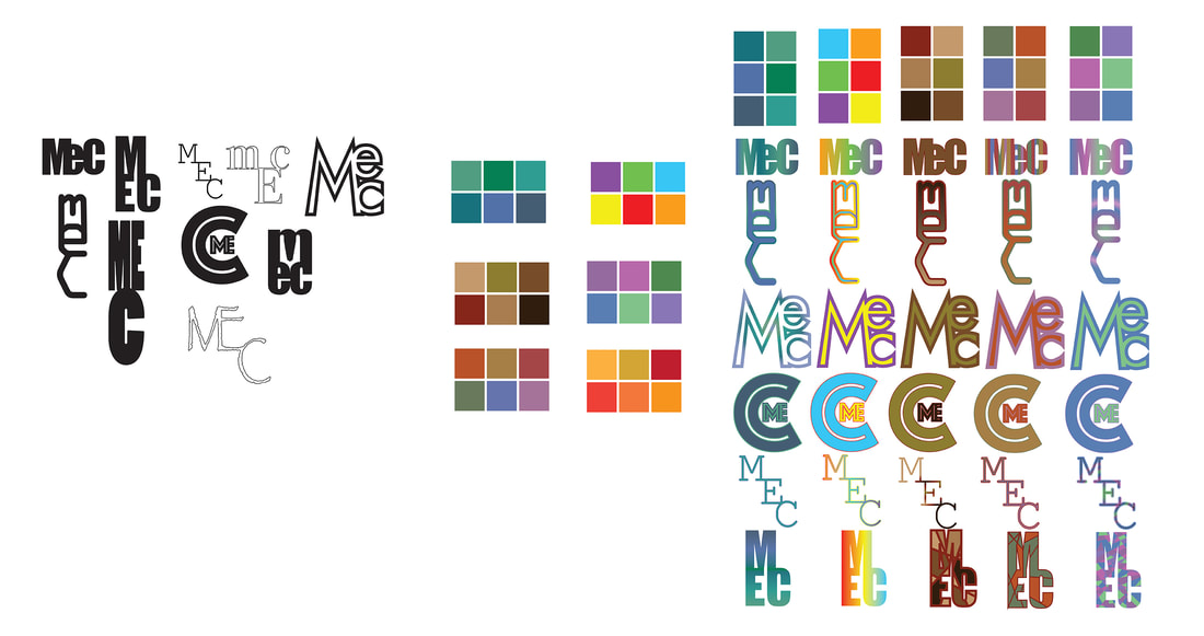
Experiment with the negative space of your design, using your favorite color palette.
 RSS Feed
