Due Date:
Two weeks
Parameters for each square:
Tools and Materials:
Adobe Illustrator and/or Adobe Photoshop
Prepare for this by studying the elements and principles of art:
Square 1 - Positive and Negative Shapes –
Two weeks
Parameters for each square:
- Each square is 8” x 8”
- Illustrator (Later, textures and effects can be added in Photoshop)
- Open in 300 ppi at 8 x 8" if doing Photoshop editing)
- No distortion of the letters
- In the beginning, no filters, effects, or gradients
- May use transparencies and/or mode changes (i.e. multiply, etc.)
- May use pathfinder to cut letters
- Color scheme will be similar for all designs
Tools and Materials:
Adobe Illustrator and/or Adobe Photoshop
Prepare for this by studying the elements and principles of art:
Square 1 - Positive and Negative Shapes –
- Hide one large letter in the square so that there is a pleasing arrangement of shapes
- The letter should be cropped by the borders of the square.
- Your color scheme for all the other designs may be based on this one.
- Include strokes on both the positive shapes (the parts of the letter) and the negative shapes (the spaces in between and around the letter)
Square 2: Pattern
Create a square, symmetrical pattern that uses only letterforms.
Create a color scheme that relates to the first square
- Just use black letters on a white ground in the beginning.
- For every character you type, Create Outlines
- (“Select All”, then go to “Type” in the upper menu, then “Create Outlines”)
- (“Select All”, then go to “Type” in the upper menu, then “Create Outlines”)
- Rotate or Reflect the character as needed
- (“Object” - “Transform” - “Rotate” or “Reflect”)
- (“Object” - “Transform” - “Rotate” or “Reflect”)
- Combine letters to create a motif (a small design) to fit into a section of the gridded square.
- Group each motif (“Object” - “Group”) - or use Pathfinder to “Unite” the parts
- Repeat the motif(s) to create pattern(s)
- Align the repeated motifs using the Align tool
- Consider adding breaks or additional patterns.
- "Pathfinder" - "Unite" all letters into a single "web" of lines if possible.
- Add color to both the positive and negative spaces.
Square 3 - Movement
Carry the viewer’s attention throughout the picture plane.
You can do this by creating implied “paths” through lines, shapes, and differences in tonal value and color.
Use Adobe Illustrator to illustrate directional movement in an 8" x 8" square, using only typographic characters (letters and numbers). Create a color scheme that relates to Square 1.
You can create directional movement by:
- Using diagonals
- Directional "pointers" - lines and shapes that lead you in certain directions
- Rounding corners of the picture plane (by using sections of large, curved letters)
- Visual pathways (created by differences in value and color between the "path" and its surrounding areas)
- Avoid using horizontals or symmetry, as they will diminish the sense of movement.
Square 4 - Symmetry
Using only undistorted type, create a sophisticated symmetrical design
Create a color scheme that relates to the first three squares.
Symmetry in Film:
Square 5 – Depth
Create the illusion of three-dimensional space by using changes in size, contrast and color, and by overlapping
- Placement - lower on picture plane often reads as closer
- Scale -- changes in size
- Contrast -- more contrast in front; softer in back
- Color -- more intense in front; less saturated in back; warmer in front; cooler or more neutral in back
- Overlapping
Square 6 - Rhythm/Repetition
Create a square design that uses and illustrates the principle of rhythm. As in the previous squares, use only letters, numbers, and other typographic characters from your keyboard.
RHYTHM is a principle of design that suggests movement or action. Rhythm is usually achieved through REPETITION of lines, shapes, colors, and more. It creates a visual tempo in artworks and provides a path for the viewer's eye to follow.
RHYTHM is created when one or more elements are used repeatedly to create a feeling of movement.
"Surface" Effects
Once your six typographic designs have been made in Illustrator, use Photoshop to add gradients, drop shadows or other layer styles, lighting effects, and/or textures to each of your squares, then combine all 6 squares into an interesting, unified design (An option for the combination is a cube -- see below.).
Objectives:
Steps:
Open each EPS square in Adobe Photoshop
To rotate or resize squares:
Once your six typographic designs have been made in Illustrator, use Photoshop to add gradients, drop shadows or other layer styles, lighting effects, and/or textures to each of your squares, then combine all 6 squares into an interesting, unified design (An option for the combination is a cube -- see below.).
Objectives:
- Add richness and detail to a design.
- Apply the principle of Unity/Harmony to a multi-piece artwork
Steps:
Open each EPS square in Adobe Photoshop
- In dialogue box that pops up: 300 ppi, RGB Color Mode, then
- Crop with Crop Tool.
- Go to Image - Canvas Size
- Select individual shapes with Magic Wand tool, then
- Select use Gradient tool.
- Select, copy and paste the shape/area you want to add the effect to, then
- Go to Layer - Layer Styles
- Select individual shapes, then
- Go to Filter - Filter Gallery
To rotate or resize squares:
- In the Layers palette (on right side of screen), select the layer the square is on, then
- Edit - Transform - Scale or Rotate
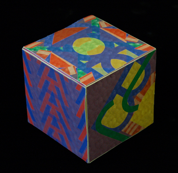
Cube
Once your designs have been completed, arrange them to create a cube construction. As a three-dimensional construction, consider visual movements and connections between one side and another. To be unified, consider how the appearance of opposing sides will play out once the box is constructed.
See the images below for the layout.
Grading Criteria:
Helpful Resource:
Depth and Perception in Art - Hanover College Psychology Department
Self Critique Questions
- Personal Investment
- Listens well
- Effective use of time - Productivity
- Stays on task consistently throughout every period
- Curiosity
- Applies feedback
- Experimenting; Trying new things with artwork
- Listens well
- Design/ Artistic Concepts
- Understanding and illustration of the artistic concept
- Unity of color scheme
- Overall visual impact
- Understanding and illustration of the artistic concept
- Technical Quality
- Skillful use of digital tools and techniques:
- Conversion of Type to Outline
- Pathfinder to Unite and Divide
- Use of Strokes to positive and negative shapes
- Conversion of Type to Outline
- Refinement
- Skillful use of digital tools and techniques:
Helpful Resource:
Depth and Perception in Art - Hanover College Psychology Department
Self Critique Questions
- Which of your designs is the strongest? Why?
- Around which artistic principal did you have the most difficulty designing? Explain why.
- In what ways is your series of designs unified and cohesive? In what ways is your series disjointed? Describe your color scheme(s) and style(s).
 RSS Feed
