Graphic Design
  • Current Assignments
  • Course Expectations
  • Curriculum
    • Curriculum Map
  • Resources
  • Burlington High School Art & Design Program

Current Assignments

Logo

5/24/2022

0 Comments

 
Picture
Picture
Due Date:
Four days

Project:
Using Adobe Illustrator, create a logo that incorporates lettering and representational elements

About Logos:
  • The word "logo" is derived from Greek ("language").
  • A modern pictogram
  • Identifies and represents an organization, business, product, or special event such as a conference.
  • A symbol; an identifier.
  • An embodiment of an organization that fosters instant visual identification and recognition.
  • Large amount of information compressed into a single visual statement
  • "Can't help but see it."
  • Can evoke a strong emotional response.

A logo takes a great deal of thought to make.


Objectives:
  • Communicate ideas about a company
  • Be inventive
  • Use letters as shapes
  • Make connections between letters and pictures
  • Create finely detailed work
  • Create order, cohesion and visual impact

Materials:
  • Pencil and paper
  • Adobe Illustrator

Grading Criteria:
  • Design (Visual Impact)
  • Technical Quality
  • Personal Investment

To Start:
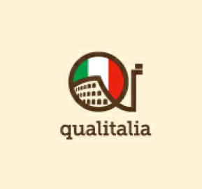
View and discuss professional logos.

Process
​
1. Answer these questions to help define the logo's message and spark ideas.:
  • What's the name of the company?
  • What image does the company want to project? What do they want to say about themselves?
  • Who is the audience?
  • Where and how will the logo be used? (Large or small formats, or both?; On trucks? On signage? Letterheads, business cards, other printed materials.

2. Brainstorm ideas to symbolize the message you want to convey.

3. Collect photographs that can serve as inspiration and reference for your idea. In Photoshop, combine these photos in a document to create a visual reference board for your sketches. Print it.

4. Using these references, sketch many drawings so that you better understand the visual nature of the subject(s).

5. Try various ways to combine the subjects/ideas.

6. Further develop (streamline, stylize, and refine) one or more of the sketches so that it is a self-contained image that clearly conveys information about the business in a highly impactful and easily identifiable way.
0 Comments

Magazine Advertisement

5/20/2022

0 Comments

 
Project
Using your photo-edited image from the previous project ("Extreme!"), create a magazine advertisement that includes:
  • A product name
  • Descriptive "copy" (text)
  • A tagline or slogan
  • A logo for the product or brand

The ad can be either full page (8 1/2 x 11") or a two-page spread (17 x 11").

Organize your design based on the following design criteria:
  • Visual Hierarchy
  • Contrast
  • Repetition
  • Alignment
  • Proximity

Objectives:
  • Work with Illustrator and Photoshop in combination.​
  • Apply your knowledge of contrast, repetition, alignment and proximity
  • Apply your understanding of visual hierarchy
  • Sell a product by selling an idea
  • Write informative and engaging text
  • Use type expressively.
  • Unify a design through color
  • Create a design that will grab the viewer's attention, draw them in, engage them and give them a sense of the product or service you are selling.

Parameters:
  • Adobe Illustrator
  • Use a Sans Serif font for the copy (descriptive text).
  • The product you are selling cannot be a medication (That's been overdone.).
  • Save as "ad yourlastname.eps" in Illustrator EPS file format
  • DO NOT put image in Photoshop in the last stages.

Tips:
  • If a two-page spread, be aware of the gutter midway through the design.
  • Use guidelines to align elements with one another.
  • Use colors in the photograph as the colors in the text.

Grading Criteria:
  • Concept
    • Clear Communication of an Idea
    • Inventiveness
    • (Clearly convey information about the product/service; grab and hold the reader's attention; get reader interested in or excited about the product/service by using humor or other strategies of visual engagement)
  • Design
    • Well-chosen typefaces
    • Skillful application of these design concepts: Visual hierarchy, contrast, repetition, alignment, proximity
    • Overall visual impact
  • Technical Quality
    • Skillful use of Adobe Illustrator
    • Proper inclusion of photo edited TIFF file from Photoshop
    • Use of guidelines for alignment
  • Personal Investment


0 Comments

Extreme! -- Exaggerating Your Message

5/18/2022

0 Comments

 
Project: 
Using digital photography and Photoshop (combining, manipulating, and editing your own photographs), make a strong, clear, simple visual statement, without words, that EXAGGERATES.

Medium:
Photo-editing and photo-collage in Photoshop (No Illustrator)

Objectives:
Digital Illustration
  • Arrange and shoot high-quality photographs that are well focused, well exposed (Good range of tonal values and contrast; good color), and expressive.
  • Develop skills with photo-editing in Photoshop.
  • Stress a point through exaggeration of that feeling or concept.​

Grading Criteria:
  • Completion of all parts (Turn in brainstorm list and thumbnail sketches)
  • Quality of Photographs -- Remember that all photos must be shot or arranged by you specifically for this project. (i.e. They must be new.).
    • All photos are new and taken specifically for this project.
    • The photographs are absolutely your own creation.
    • Photographs are focused well and exposed well (good color, good tonal value, good contrast)
  • Strength of Design / Composition
  • Strength of Expressiveness of Feeling/Concept
  • Technical Quality
  • Personal Investment / Work Habits

PROCESS

Step 1: What’s your statement?


It should be a simple statement that can be used to sell an idea or a product.
Brainstorm/write down a list of possibilities — What can you do to express the different concepts?

Some possibilities:​
  • Noise
  • Silence
  • Anger / Rage
  • Pain / Agony
  • Love
  • Romance
  • Passion
  • Ecstatic
  • Speed
  • Craftiness
  • Potential
  • Pride
  • Sadness /Sorrow/Depression
  • Studiousness
  • Hardworking
  • Hardworking
  • Strength
  • Power
  • Agility
  • Darkness
  • Fear
  • Light
  • Panic
  • Stress
  • Exhaustion
  • Confusion
  • Curiosity
  • Growth
  • Gluttony
  • Gossip
  • Freedom​
  • Mischief
  • Mischief
  • Intelligence
  • Spirit
  • Energy
  • Cowardice
  • Bravery
  • Joy
  • Practicality
  • Competition
  • Spirituality
  • Security/Safety
  • Secrecy
  • Anxiety
  • Distress
  • Cleanliness
  • Sloppiness​


Step 2: How can you exaggerate the message visually?
Draw a series of (at least three) thumbnail sketches to develop your visual ideas and to compose the image.

Consider the following:
  • Composition
  • Color scheme
  • Style
  • Lighting
  • Point of view
  • Cropping
  • Appearance of model(s) (subjects)
  • Gesture
  • Facial expression
  • Environment / Surroundings (if any)


Step 3: What do you need to create this image?
Remember that all photos must be shot or arranged by you specifically for this project. (i.e. They must be new.).
Find props, enlist models, and find appropriate places to take your photographs.
  • Models
  • Props
  • Environment
  • Tools, materials, and techniques

Step 4: Plan and execute a series of photos potentially to be used in this composite image
Make sure your photographs are high resolution and are exposed well and focused well.

Step 5: Use Photoshop to create the digital illustration of your statement.
  1. In Photoshop, double-check resolution (Go to “Image - Image Size” -- Document Size should be 300 pixels/inch at printing size -- at least 8.5 inches x 11 inches).
  2. Use Photoshop to combine and edit your photographs into a unified image with a single, clearly expressed idea.
  3. Save your combined, photo-edited image as “extreme yourlastname”.

**The final image should be RGB color mode, 300 dpi, and at least letter size.**


Grading Criteria:
  • Completion of all parts (Turn in brainstorm list and thumbnail sketches)
  • Quality of Photographs
    • All photos are new and taken specifically for this project.
    • The photographs are absolutely your own creation.
    • Photographs are focused well and exposed well (good color, good tonal value, good contrast)
  • Strength of Design / Composition
  • Strength of Expressiveness of Feeling/Concept
  • Technical Quality
  • Personal Investment / Work Habits


0 Comments

Title Art: Band or Video Game Graphic

5/17/2022

1 Comment

 
Due:
Three days

Project Description:
Using the Type Tools and Layer Styles of Adobe Photoshop, create two treatments of a type-based graphic for a band that can be used for a CD cover, a T-shirt, or a button. It should include the band’s name and an album title, and the style and color should be appropriately expressive. THIS IS NOT AN ALBUM COVER, JUST THE GRAPHIC.

Alternatively, you may create the title-art graphic for a video game. This should include a title and subtitle.

The graphic must:
  • Be self-contained -- The graphic itself is a beautiful shape
  • Combine type plus shapes
  • Alter the type - Not just downloaded and dropped in
  • Look three-dimensional - Imply depth
  • Use Layer Styles in Photoshop
  • ​Have texture (Use the Texturizer in the Filter Gallery)
  • Be 300 pixels/inch at printable size


Objectives:
  • Experiment with the type tools (horizontal type tool, vertical type tool, type mask tool)
  • Experiment with the shape tool
  • Experiment with layer styles
  • Experiment with filters.
  • Rasterize and transform type
  • Use all of the above to create heightened visual impact.

Materials:
  • Adobe Photoshop (You may begin your work in Illustrator, but elements will need to be modified and refined in Photoshop)

Parameters:
Format as follows:
  • Width: 10 inches
  • Height: 7.5 inches
  • Resolution: 300 pixels/inch (Important: A lower resolution will result in a printed image of poorer quality.)
  • Color Mode: RGB
  • If you would like to work beyond these limitations (for example: work larger than letter-size) consult Mr. Ratkevich.
  • Don't just download special fonts. Convert fonts to outlines, then modify them to make them distinctive and unique.
  • Include other design elements (shapes, outlines, textures, layer styles)


Grading Criteria:
  • Work Habits
  • Skill with all the tools and methods listed above (type tools, layer styles, rasterize, transform)
  • Experimentation / Exploration
  • Design / Visual Impact
1 Comment

Movie Poster

5/15/2022

0 Comments

 
Due Date:
  • One week.

​
Project: 
  • Create the promotional poster for a movie, real or imagined. 
  • The artwork must be completely original, and must include new photo(s) you have taken specifically for this project, or your illustrations based on those photos.


Objectives:
  • Create the appropriate sense of mood from your decisions about color, style, text and imagery (Communicate what type of movie this is and what it's about through visuals.).
  • Improve your skills with digital photography.
  • Integrate photos into an Illustrator-based design.
  • Apply your understanding of visual hierarchy to bring attention to the most important information in the poster.
  • Apply an understanding of the Graphic Design principles of contrast, repetition, alignment and proximity
  • Communicate an idea through selection of appropriately expressive type.
  • Create a visual personality through the title art and other elements


Parameters:
  • Created in: Adobe Photoshop and Adobe Illustrator
  • Size: At least Letter size (8.5 x 11”), up to 11 x 17”
  • Final File format: Illustrator EPS (Start project in Photoshop as PSD.)
  • Use original photographs (that you take specifically for this assignment), or vector-drawings based on those photographs
  • NO photographs by someone else, clip art, or "borrowing" from famous images of the movie or musical
  • Shoot your own photographs from student models, and use those as a drawing reference.
  • All type must be converted to outline before turning it in


Text:
  • “Director’s Name” Presents:
  • Movie Title
  • Actors
  • Tagline
  • Rating
  • Other: Studio Name, Other Actors, Screenwriter, Producer, Director, etc.


Grading Criteria:
  • Design / Visual Impact
  • Inventiveness / Creativity
  • Expressiveness / Communication
  • Technical Quality / Craftsmanship (including quality of photography)

These are the tools we use to measure your success:
  • Creativity Rubric
  • General Art Rubric
  • Studio Habits of Mind Rubric
  • Writing Rubric​

​Resources:
  • In preparation for your own theatrical poster designs, here's a link to 50 great movie poster designs.
http://www.smashingmagazine.com/2008/10/12/50-beautiful-movie-posters/


To Start:
  1. Collect images of effective promotional graphics for movies. Ask yourself: what makes them work so well?
  2. Collect information and visual references that relate to the subject(s) of the movie.
  3. Thumbnails and rough drafts (especially of figures. What poses will you need?)
  4. Take photos of student models to use in the poster or as visual reference for your drawings.

Take AT LEAST TEN GREAT PHOTOS
  • Well framed
  • Well composed
  • Close up
  • Focused
  • Good exposure -- good contrast and wide range of values
  • Good, rich color


Helpful Resources:

Movie posters may prove inspirational. There are two books of movie posters (of movies from the 1960s and 1970s) in Mr. Ratkevich's Portfolio classroom, Room 215.

Self-critique Questions

Ask yourself these questions for your final execution:
  • Is the concept clear?
  • It is visually unique and interesting? Does it have visual impact?
  • Does it give the viewer a sense of what the movie is about?
  • Does it give the viewer a sense of the genre: comedy, drama, action, thriller, horror, etc.
  • Is the text clear and READABLE?
  • Is the spacing between letters, words, and lines comfortable, or jammed, tight, too far apart, etc?
  • Have you used VISUAL HIERARCHY to bring attention to the most important element first, the next most important element next, etc.?
  • Is the spacing CONSISTENT?
  • Have you ALIGNED the text?
  • Is the typography EXPRESSIVE?
  • Have you visually EMPHASIZED the more important words and phrases?
  • Have you designed the entire PICTURE PLANE?
  • Is it a unified, cohesive DESIGN (Is it visually impressive when you see it from a distance?).
  • Does it apply both VARIETY and UNITY? (For example, different fonts, sizes, etc, but all used more than once throughout the design)
  • Does the color scheme (more than two or three colors) convey a sense of mood appropriate for the content of the movie?
  • Have you experimented with styles and arrangements?
  • Have you considered and tried out different elements and techniques for the background? (textures, design elements, gradients, etc.)
  • Are you ABSOLUTELY sure this is the very best you can do with what you know about design?

0 Comments

Typeset a Poem or a Recipe

5/13/2022

0 Comments

 
The images above are student works based on recipes. Whether or not you choose to design for a recipe or a poem, the challenges will be similar: use type expressively and create a stunning design.
These images above are examples of professional graphic designers interpreting poems.
Due: One Week

Medium: Adobe Illustrator and/or Photoshop, Photo Inkjet Print
Size: Printable to 13 x 19"

Find a recipe, or select a famous poem or student poem (provided by the English department) from this link.

Read the text carefully. Consider its meaning and mood.

Consider the most appropriate fonts, styles and color scheme to express the mood of the piece.

Use changes and contrasts in size, weight, style, color, and tonal value to emphasize specific words and phrases.

The entire poem will be on a single artboard of 13 x 19".

If it will serve your expressive purpose and make for a stronger design, you may use additional elements and shapes to design the page.

For inspiration, here's a selection of graphic designs of poems from Pinterest. Look up more. I searched "graphic design poem", and found many fine professional examples.

Some things to address in your design:
  • Alignment (left, right, centered, justified)
  • Leading
  • Kerning and Tracking
  • Readability
  • Expressiveness
  • Unity / Cohesion
  • Space between the text and the edge of the artboard/page.

Grading Criteria:
  • Design (Effective Use of the Principles of Art)
  • Expressiveness
  • Technical Quality / Craftsmanship
  • Personal Investment / Work Habits
(More detailed criteria at this link.)
​
Before turning this in:
  • Convert all type to outline.
  • Save as EPS, TIF (300 ppi, 10" high), and JPG (72 ppi, 12" high).
  • Print to scale to 13 x 19" (SuperB) Ultra-premium Photo Paper Matte
  • Mount print on black paper, label, and adhere velcro coins to back for exhibition.

Questions to ask yourself (Self-critique):
  • Is the text clear and READABLE?
  • Is the spacing between letters, words, and lines comfortable, or jammed, tight, too far apart, etc?
  • Is the spacing CONSISTENT?
  • Have you ALIGNED the text?
  • Is the typography EXPRESSIVE?
  • Have you visually EMPHASIZED the more important words and phrases of the poem?
  • Have you organized the poem to give a sense of timing or cadence of speech? In other words, are there visual “pauses” or breaks with new stanzas or important breaks in the text?
  • Have you designed the entire PICTURE PLANE?
  • Is it a unified, cohesive DESIGN? Is it visually impressive when you see it from a distance?
  • Does it apply both VARIETY and UNITY? (Different fonts, sizes, etc, but all used multiple times throughout the design)
  • Does the color scheme (more than two or three colors) convey a sense of mood appropriate for the content of the poem?
  • Have you experimented with styles and arrangements?
  • Have you considered and tried out different elements and techniques for the background? (textures, design elements, gradients, etc.)
  • Are you absolutely sure this is the very best you can do with what you know about design?
0 Comments

Type as Illustration: Book Jacket Cover

5/11/2022

0 Comments

 
Typography: Type as Illustration: Book Jacket Cover

Due Date:
Two days


Project:
Using only type in Adobe Illustrator, create a jacket for book cover. It should include the title (and perhaps a subtitle) and the author, and the type should be used as illustration.

(Project from Graphic Design on the Desktop, by Marcelle Lapow Tour)


Media:
​Adobe Illustrator


Grading Criteria:
CONCEPT
        Clear Communication of Idea
        Inventiveness
DESIGN
        Well-Chosen Typeface
        Image has Visual Impact
CRAFTSMANSHIP
     Skillful use of tools of Illustrator
WORK HABITS
0 Comments

    Mr. Ratkevich

    781.273.7024
    [email protected]
    ​

    Archives

    October 2025
    September 2025
    November 2023
    October 2023
    March 2023
    December 2022
    November 2022
    October 2022
    September 2022
    June 2022
    May 2022
    January 2022
    December 2021
    May 2021
    March 2021
    February 2021
    January 2021
    December 2020
    November 2020
    October 2020
    February 2020
    October 2019
    August 2019
    June 2019
    May 2019
    April 2019
    February 2019
    January 2019
    October 2018
    September 2018
    May 2018
    January 2018
    December 2017
    November 2017
    June 2017
    May 2017
    April 2017
    January 2017
    October 2016
    April 2016
    January 2016
    December 2015
    October 2015

    Categories

    All

    RSS Feed

Powered by Create your own unique website with customizable templates.